
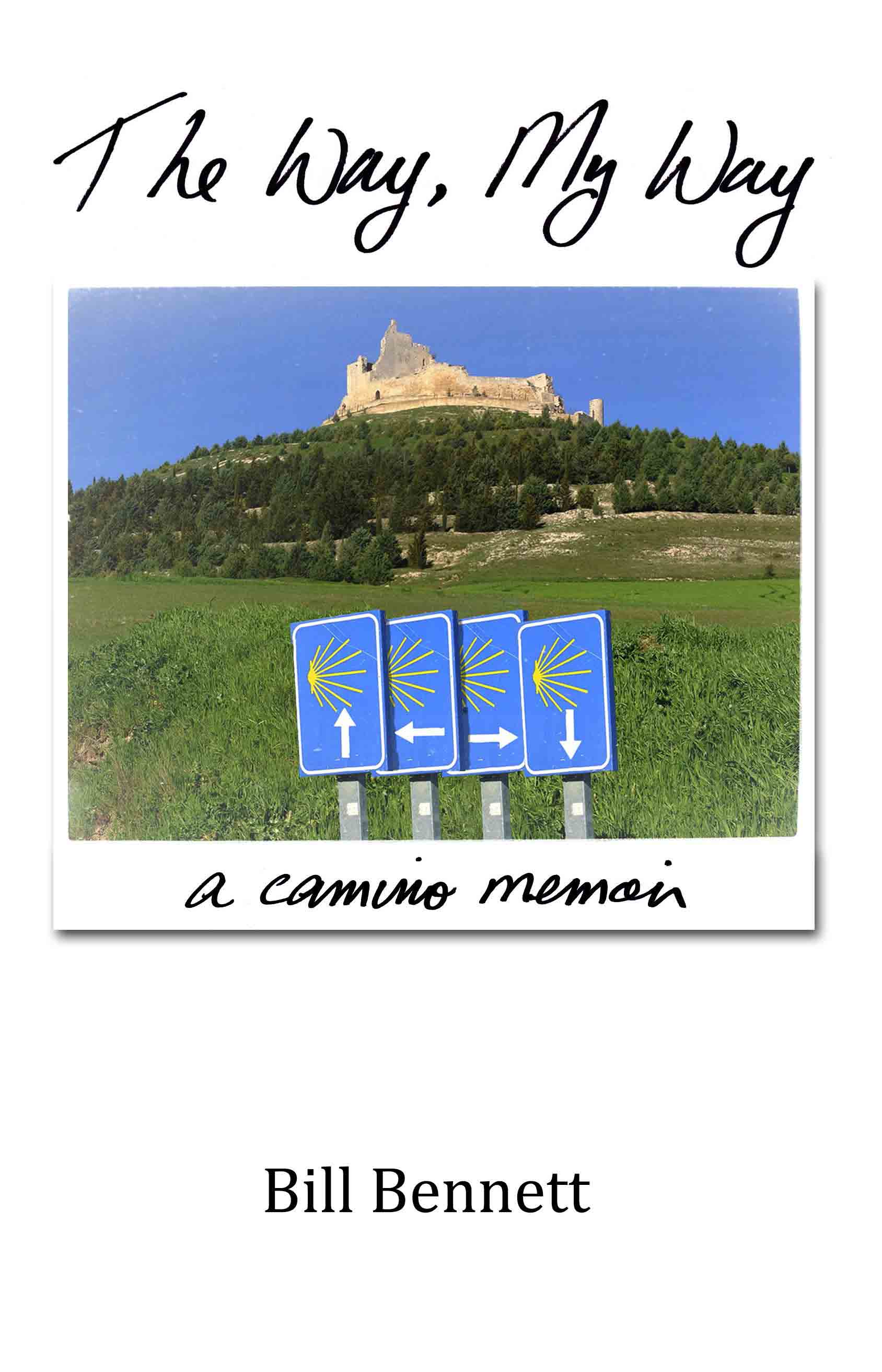
The book cover artwork has come in –
It’s designed to work principally as a thumbnail on Kindle, iBooks etc.
However, the manuscript is now going to a big time publisher at Simon and Schuster in New York. So I’m going to hold off ebook publishing until I hear whether they want to take it on.
That said – I will offer it as a free pdf next week for anyone on this blog who wants to read it.
Let me know which cover you like the best…

The top one! Good Luck!!
Terry
LikeLike
I like the first one, Bill. The second is a little too deliberately “funny”-its strained.
LikeLike
Dear Sister –
thank you!
I am really undecided – too close – so your feedback is really useful!
Bill
LikeLike
Thank you Andrea by the way for the Simon & Schuster connection –
Fingers crossed!!
LikeLike
ps ~~ I would LOVE a pdf for my iPad for my walk in 4 weeks…
thank you so much!!
LikeLike
Hi Terry –
thanks for the feedback!!
And a pdf will be no problem. By next week it will have been proof-read twice, thoroughly, so it will be ready to distribute.
Bill
LikeLike
Thank you Julie too for the Greg Banks connection –
He’s terrific!
LikeLike
My choice would be the first picture. The title is natural, not a canned font.
I’m not especially fond of the font in the second picture, a little too common in my opinion.
Arlene
LikeLike
ps I’d love a copy also. It will come on Camino with me also
Arlene
LikeLike
Hi Arlene –
I would be delighted to send you a pdf next week.
Bill
LikeLike
Hi Arlene –
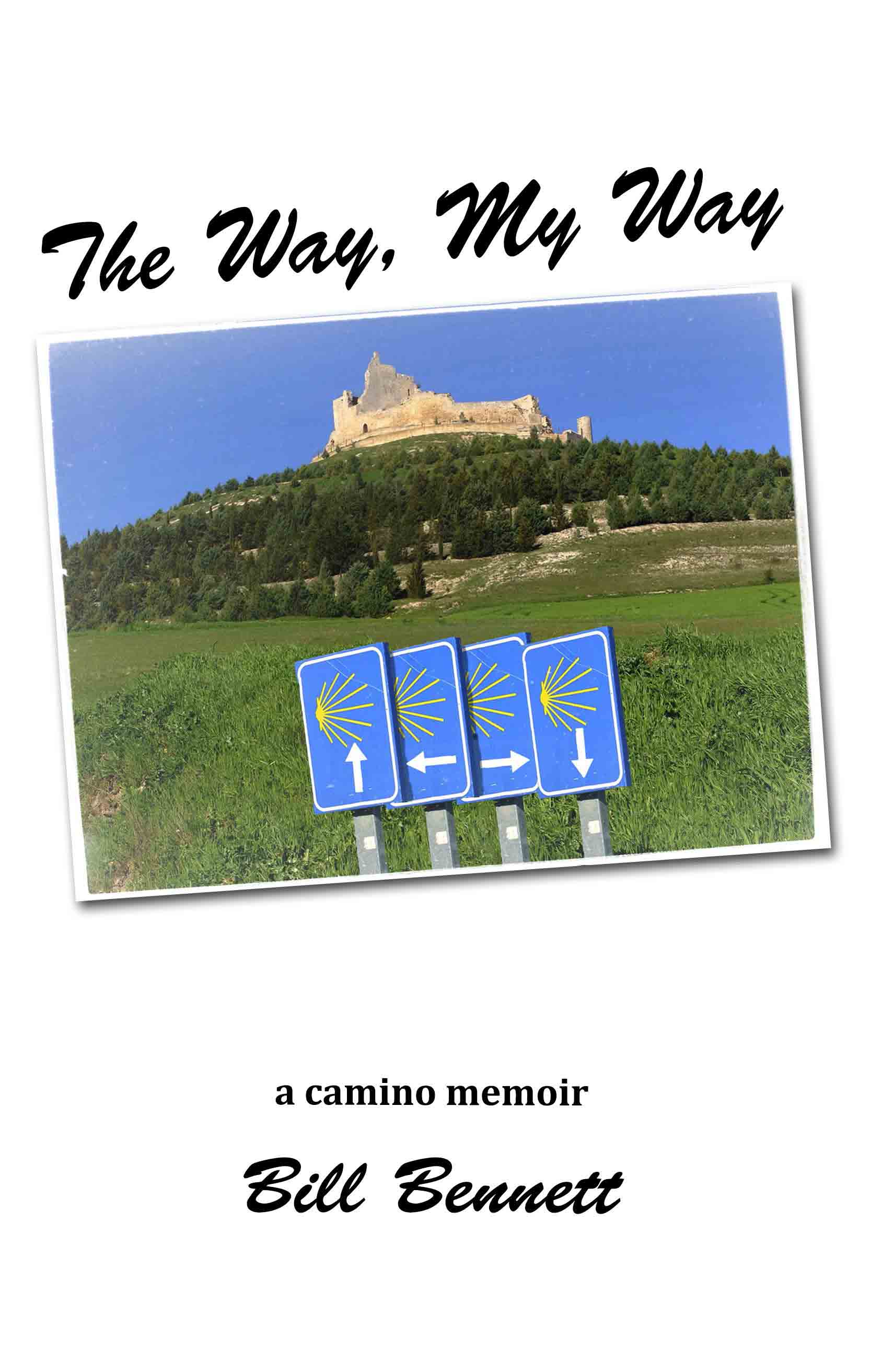
I must have gone through hundreds of established handwriting fonts, and I didn’t like any of them – so with the second version what I did was write the title and log line myself (must have done a hundred versions!) then scanned it and sent it to the designer. So that writing on the 2nd one is my handwriting.
Bill
LikeLike
Wow, I’m surprised!
You must received an A+ in penmanship in school. It is absolutely perfectly formed.
But I still like the first one.
Arlene
LikeLike
Ooops – sorry, my handwriting is on the FIRST one.
The second one is a generic handwriting font.
(You’re right – it would be near impossible to get my handwriting that perfect!)
😀
LikeLike
Going against convention, I like the bottom one. It is a little off center like it’s author. That is a compliment. 🙂
LikeLike
haha – thanks Steve!!
I’m still undecided – so that’s why this feedback is so handy.
I know from helping design move posters for so long that sometimes the more obvious stuff works – particularly when (in this instance) it’s for eBook distribution. So you have people scanning quickly, and scanning thumbnails, and you have to get across very simply yet effectively the “tone” of the piece.
A cover for a proper print book would be different, because the viewing experience is different.
This will be seen on smartphone screens – very small – so it has to have immediate cut-through.
Bill
LikeLike
I first viewed the proposed covers on my phone, that’s where I happen to be reading email at the time. My eyes couldn’t get past the first cover to go to the second one! ( so a vote for #1. May I please have a PDF copy of the book too? Thanks!
Susan
LikeLike
Hi Susan –
Thanks for the words on #1
And yes, sometime next week I’ll put out a blog calling for anyone who wants a PDF.
Still doing polishes!
Bill
LikeLike
Simon & Schuster. Pretty big time.
LikeLike
Well, thanks to a wonderful friend and work colleague in Los Angeles, (Andrea!) she will pass on the manuscript to someone high up on the food chain there.
Fingers crossed she likes the “voice.”
Bill
LikeLike
Steve, what’s Barb up to these days? And how’s your photography coming?
LikeLike
Barbara is fine. Having a little knee problem, but otherwise…………Honestly, I have not gotten into the photography like I thought I would. The iPhone is too good a camera and it is always perfectly handy. That is hard to beat. Who knows what I will do tomorrow. I spent this week researching Harley Davidsons because I am getting the urge to have another one. Who knows, I might ride up to see you, but not before summer, you can be sure.
LikeLike
My door will always be open to you, Steve. Ride like the wind,but be careful,ok?
LikeLike
I too prefer the first one Bill, and looking forward to receiving a pdf. good luck with the publisher! ingrid
LikeLike
Thanks Ingrid!
I’ll pick your brains after you’ve read the book!
Bill
LikeLike
Put me down for No.2 I do not have an artistic bone in my body but I just like the off center look…and yes to the book copy for me too…cheers les
LikeLike
Now worries Les –
thanks for the feedback!
Bill
LikeLike
I vote for the first one. I like your handwriting, and prefer “a Camino memoir” being a part of the photograph. I do like the off-centeredness of the second one. I will hold off on requesting the pdf version of your book and buy one for you to autograph at your book signing when Simon & Shuster publishes it! Julie
LikeLike
Julie –
haha, that would be very cool!!
thanks for your feedback on the covers.
Seems like #1 is getting majority support!
Bill
LikeLike
I like the handwriting in the first one…what does it look like with the off-kilter photo? I am so excited to hear what S & S says!!! Can’t wait to get the e-book soon!
LikeLike
Dear Julie –
Thanks for these thoughts!
I have no expectations for this book. And the publishing industry is in meltdown at the moment, so I’m not fussed either way.
The book is something I’ve had to do, more for myself than for anything…
Bill
LikeLike
Bill, the first cover has something special about it. Even as I read down through the replies, long before the acknowledgement that it is your handwriting, I felt it was the one. I do like the slightly turned photo, however. As Julie indicated, can there be a blend?
Very excited to know that the PDF version will be available soon. Please add me to the list, so you can re-walk the Camino with me, via my iPad. much easier on your knee!! I would also purchase a print version when available.
Blessings
Anne
LikeLike
Dear Anne –
thank you for your thoughts on it –
I think with the raggedness of the handwriting in #1, skewing the image might be too much.
But it lacks something – It’s too bald down the bottom half, and not sure what I can do about it.
I want it to be a very clear design – like the design for this blog, and for the forum too.
PDF should be available in a few days – but I want to get the photos in first!
Bill
LikeLike
For once I agree with the majority. I like the 1st ….. I’m assuming its a very personal story and to me that is conveyed better in the first picture. Good luck with it all Bill. Very exciting.
Debbie
LikeLike
Thanks Debbie – yea, the story does come with a particular point of view! The handwriting does definitely personalise it!
😀
Bil
LikeLike
Hello Bill
I like the first one as well. I like the way the subtitle goes with the title: ‘The Way, my way : a Camino memoir’ with the picture, is an integrated message. The second one, with the subtitle tacked down the bottom with your name, away from the rest of the title, feels a bit disconnected somehow. And I like the font of the first one as well.
All the best with your publication plans – and I’d love a pdf of the book too please.
Regards
Elizabeth.
LikeLike
Hi Elizabeth –
Good point about #1, thank you.
And yes,
I like the scrappiness of the handwriting – 🙂 – it feels authentic I think.
And yes, no worries about the PDF – will set that up as soon as everything’s finished.
Bill
LikeLike
Hi Bill,
As I had mentioned to Sister, I am back from Hawaii and have been having lots if trouble with my iPhone and a storage problem, I swear from all the correspondence of everyone from your Blog. That is a compliment! However, I had to wait till I was on my computer to be able to respond. Its very frustrating and of course none of this is your problem, but it means I am unable to respond to anything unless I am home! Okay, enough of that! Congrats on so many levels, the book, Simon and Schuester, etc, etc, etc. WOW, you continue to amaze!
I’m going out on a limb here, re: the Book Cover. I like #1 but to be honest, I had imagined something much stronger from you. It’s a good cover, but to me its not half as great as your message and your writing. There, I’ve said it. Your photography has been so poignant that I had expected the cover to jump off the page and for whatever reason, this doesn’t. Do I have a better idea, probably not, but just want you to know that in my mind a stronger cover would pop the ideas and stories that you sharing. Hope that doesn’t offend as it not meant to, but rather encourage perhaps one more look see of your over the top work. Either way, I am really looking forward to reading all of the chapters when its published. Good work, Bill and thank you for sharing so much with all of us………….xoox
Jill
LikeLike
Hi Jill –
Welcome back!
And thanks for your frank comments about the cover.
How do you think it should be?
And does anyone else on the blog think it’s not good enough?
Bill
LikeLike
Bill, a good minor fix would be to expand the photo to be the whole cover,not just a feature, and then put the script on top. Use the same fonts, even. Might try maki g them bolder, but the background is pale enough to frame the lettering
LikeLike
Hi Bill,
Trying this on my phone as I tried to empty my trash on my computer hoping it would add some additional storage. Glad to be back.
I’m not sure I know how to tell you but that’s a weak entry. Meaning your message is so much more powerful. You are trying to tell people that
you, Bill,
have a,
Bill of goods
nnto introduce them to, a new way of thinking and being based on your experience! Right!’ So, lets get an image that realty jumps out at them. I’m not normally a person who says this stuff! I think it but I’ve been properly silent. But no more!
LikeLike
Ok Jill, thanks for your frank words.
What would you suggest then?
What kind of image would say all that?
Bill
LikeLike
Well my friend I did try to send a respond which actually might have launched so this may be moot. But, if not, I guess I will offer another opinion. if I look at the cover at a distance, I see a crown sitting on top of a beings head( the cathedral walls being the crown) with the eyes peering out at me from the greenery, with the nose being the whitish concrete dead center right above the grass. The Camino signs could either be a necklace around that creatures neck or they could see the signs as possibilities of which direction they could potentially take if they are so wiling. I hope I haven’t lost too many of you with that other interpretation but that is what I see. So, if you see like me, we have lots of possibilities and choices or if you do not see like me then the image is weak. Maybe, you should use the image that spoke most to you, using and trusting your PGS !
Tally Ho!
LikeLike
Hi Jill –
not in any way wanting to put you on the spot –
but here’s a link to my Camino gallery. Can you please indicate which shot or shots you think might say what you’re wanting the cover to say?
http://billbennett.zenfolio.com/camino2013
It’s handy for me to get this kind of feedback.
Bill
LikeLike
Oh God, I could just kick myself I just went thru thru the photos you sent and I am more confused than ever. Let me think on it some to see if something peaks thru. K? You are just way too talented! Jeez!
Xo
LikeLike
haha – not talented Jill – but it’s a hard thing to find one image that encapsulates those things you mentioned.
Plus make it easy – at one quick glance – for a reader to understand what the book is about, and what the tone is.
Bill
LikeLike
Hi Bill, number one for me too. I like the way it looks, and your name stands out more clearly. I’d love a PDF too, to read as we progress. Only about ten days to go now. Peter
LikeLike
Only 10 days to go?
The time seems to have gone so fast Peyer!
Thanks for your thoughts on the cover too!
And savour these last days…
Bill
LikeLike
Ok, looking at this again, and looking at book covers as they appear in my iPad….Jill’s point is valid. I understand the wish to keep it simple, but how will the white background look against the white space in a library of books on an e-reader? I open my books in Nook, so I don’t know what they look like on Kindle. I know that iBooks has the “bookshelf” look.
LikeLike
Hi Julie,
Thanks for your comments.
It’s for that reason I went with the white look –
To differentiate it from all the other titles.
How do you think it should be?
Bill
LikeLike
Bill,
I am unsure if others are looking at the cover as a thumbnail or as a cover for the printed version.
As for a thumbnail print, I personally think it to be perfect. It is not cluttered with a busy image or too much text.
And I truthfully like the white space around the picture. To me that makes the title and picture jump out and grab whether thumbnail or printed version cover.
Of course that is IMHO!
Arlene
LikeLike
Hi Arlene,
That’s certainly been the thinking behind it – for it to work as a thumbnail, but not in isolation.
You have to think of all the thumbnails in a row, or in a cluster, one after the other – as happens when you’re looking for a book to buy on Kindle or iBooks.
This design certainly wouldn’t work for a printed version, in a book store. You’re right. But it hasn’t been designed for that.
The simplicity is very deliberate, to get immediate cut-through for a thumbnail.
You have to ask yourself what is the purpose of a cover. For me it is to be intriguing – not to sell, straight off, but to get the reader to look further. Read the blurb, find out more.
A cover for me has to do these things –
– It has to give you the title of the book.
– It has to give you the name of the author.
– It has to give you the genre of the book – that is, is it a romance? Is it a thriller? Is it Sci-Fi? Is it a biography? (To a certain extent, where you’re looking for the book will tell you that, but the cover has to reinforce it. In other words, the Game of Throne book covers reinforce what genre you’re reading. So do the Twilight book covers.)
– It has to give you the “tone” of the book. MOST IMPORTANT. Is it romantic? Is it scary? Is it erotic? Is it a thrill-ride? Is it humorous or comedic? Getting the tone across is the most difficult thing in key art.
– It has to ask you a question. In other words, It doesn’t necessarily have to make you want to buy it straight off, but it has to be intriguing enough, or enticing enough, for you to want to check it out further. Read the blurb, read some reviews, find out about the author etc.
– Most important of all – it has to grab your attention. It has to be eye-catching. It has to have cut-through from all the other clutter that’s jostling for your eyeballs.
I chose the white background for a few reasons.
1/ It immediately differentiates it from other thumbnails. It has cut-through.
2/ It links in with the white of this blog.
3/ There is a purity about white that gives it a spiritual connotation. Go to a bookstore (if you can find one!), go to the Spiritual section and look at how many books use white on their covers.
4/ it focuses the eye to the image.
I chose that image because it’s a very simple uncluttered composition – the blue of the sky links with the Camino blue of the signs, and it doesn’t “preach.”
It’s also the antithesis of most Camino memoir books, which usually have a long winding road on the cover and a pilgrim with a backpack.
I didn’t want that. It’s too much a cliche. I have plenty of those shots, as you all know, but I deliberately chose not to go that way.
The most important element of the design though is the signs. And the signs link in with the title – The Way, MY, Way. I emphasise MY because the book will be my particular way of seeing the Camino.
The signs pointing in different directions indicate my future, my past, my aspirations for heaven, and my probable decent to you know where!
All the signs pointing different ways is also humorous, and tells you the “tone” of the material.
But if the image was more complicated, or the design was more complicated, the eye wouldn’t immediately go to the signs, and a crucial element of the key art would be lost, or minimised.
Hence the simplicity.
Bill
LikeLike
Sorry Bill, I just went and read your prior comment about why you chose that particular picture. I of course went and picked exactly what you were trying to get away from lol Please disregard my comments 🙂 Go with the first picture except you could turn it slightly like you did the second. I like the slant on #2 but prefer the writing on #1.
LikeLike
Hi Bill, I at first glance liked the second one but after reading everyones comments, I went back and agree that #1 is better. But also I agree with Jill and I am a bit disappointed. I love books and often buy a book because I was attracted to it’s cover and that includes eBooks. I think that it is a little too simple and doesn’t “jump off the page” at me. Sorry 🙂
Emily xo
LikeLike
Oh I forgot to say Congratulations on Simon and Schuster. That is very exciting and I will keep my fingers crossed for you. I will take the Pdf when you offer it next week, but I will also buy the book when it’s published.
Emily 🙂
LikeLike
So, Happy, let me get this straight. You do, in fact, judge some books by their covers in contrast to conventional wisdom. Interesting.
🙂 Steve
LikeLike
Hi Steve,
Emily is right when she says a book cover is critical.
Like the key art (poster, video slick etc) for a movie.
A lot of people make their decisions on the cover.
Bill
LikeLike
Ha! Ha! Yes I do judge some books by their cover…..but then I go on to check the inside to see what it’s all about. Sometimes like in people the outside might look great but the insides are lacking 😉
Emily
LikeLike
Ain’t that the truth.
LikeLike
Hi Emily,
Thanks for this feedback.
That’s why I put it out on the blog, to get this kind of discussion going.
How would you like to see the cover, given that the tone of the material is humorous?
Also, S&S will be considering it – nothing more than that at this stage.
Bill
LikeLike
I’m not sure! i will have to go through your photographs again and see if something catches my eye. You might be thinking to hard about trying to capture the humorous. I will use my PGS to go through your photos 🙂
Emily 🙂
LikeLike
Hi Bill, I just went back to your Blog and the first one I clicked on was for June. The first blog that came up interestingly was for June 29th “Sneak Peak” and there is a picture there that calls to me. It speaks of your journey and feels more like the camino than the picture you picked. I think that even though your book is humorous it is about your journey and the book cover needs to reflect that more than the photo you chose, I think?
What does everyone else think? I don’t usually speak up but I feel like I should here. 😦
Emily xo
LikeLike
Hi Emily,
Thanks for speaking up! It’s good!
I just went and had a look at that shot – it’s of the black pilgrim ahead of me in the distance on a long winding road.
Take a look at my response to Arlene, which I’ve just done. It details my reasons for making the decisions I’ve made so far.
That image that you like is the ultimate Camino cliche.
Just about every book you see on the Camino has a shot like that on the cover. I have purposefully chosen not to go that way.
This book will be unlike any Camino book any of you have read, and the cover needs to reflect that.
I don’t want the cover to be like all the rest of the Camino books out there.
That said – I’ve done enough movie posters in my time to know that finding the definitive key art can be a long and difficult process – and I’m not saying that what I’ve got at the moment is perfect, or even absolutely right – but at least it’s different, and at least it gives a sense of place, and tone.
The other thing you have to consider is this – the book is being sold to people who aren’t on this blog, don’t know anything about the blog or my Camino, and know nothing about me.
They’re coming in clean.
So the “buttons” need to be a little more obvious.
Bill
LikeLike
Definately the first one! Kat
LikeLike
Cool – thanks Kat!
Bill
LikeLike
Hi Bill.
I like the first cover better. And finding out it is your handwriting makes it even better. Much more personal. Even with lots of practise copies I’m with Arlene, you have great penmanship.
I’d love a copy of your PDF. Maybe we could all be a little band of editors for you.
Thanks again for all that you give us with this blog.
Donna
LikeLike
Hi Donna,
Many thanks for your thoughts on it.
I couldn’t find a handwriting font that I really liked, hence I did it myself.
And yes, it is meant to get across that it’s a personal account of my Camino.
Bill
LikeLike
I know I just went and read your comments to Arlene and I commented again. Sorry, all the things you said made perfect sense. And you are right the picture I picked is just like all the other Camino book pictures 🙂
LikeLike
🙂
Emily, all this discussion amongst us all, on this blog, shows that it’s so hard to get this stuff right. And it’s so much in the eye of the beholder, too.
Before considering the key art for this cover, I went and had a look at some other books in a similar vein – not Camino books, but Bill Bryson, David Sedaris etc… Smart humorous writers.
And it’s interesting to look at their key art.
A lot of it is a reduction of their print book key art, to keep consistency, but looking at how they get their tone across I found very instructive.
In the end, books are sold on word of mouth.
If you read the book and you like it, you’ll talk about it and recommend it to others, and then they’ll buy it – as long as it’s priced right.
Bill
LikeLike
Reblogged this on boomerinbloom.
LikeLike
Hi Bill,
I like the first one…clean and simple!! I can’t wait to read your book!!
I have been traveling for a couple weeks and have just now been able to catch up. The tour sounds really interesting and I would love to meet Sister, Steve, Jill, Arlene and you and your wife! I will pass regretfully as I want to walk from St. Jean, my first Camino next September!
Good luck with S&S.
Debbie
LikeLike
HI Debbie –
thanks for letting me know about the cover –
also about the tour.
Yes, your first Camino should be from SJPP. Something special about that!
Bill
LikeLike
I like the first one, too. It is simpler, leaving the viewer to focus on the arrows.
LikeLike
Thank you!!
That’s what I was wanting.
Bill
LikeLike
Dear Bill, I’m with the majority. Really like the thoughtful simplicity of the 1st one and the arrows have always been very evocative for me. And of course, like everyone else, will love the pdf – and will then look forward to the hard cover version. There will always be room on my self for not just another Camino book, but yours will be special 🙂
LikeLike
britta – you are so gorgeous, thank you.
And looking forward to meeting you next week!
that will be very wonderful.
Bill
LikeLike
Hi Bill – I’m with the majority … the title in No.1 has a more free-wheeling vibe to it – it’s ‘light’ and energetic and it really jumps up at you whereas your name, as the author, is strong. Cheers – Jenny
LikeLike
Thanks Jenny –
I’m now considering another option –
the four signposts on a background of gravel – with the title above and a camino memoir just below it –
Just thinking – always thinking�
🙂
Bill
LikeLike
Hi Bill, if you like the cover of “Wild” you should look at the cover of Hape Kerkeling’s Camino book, “I’m Off Then, Losing and Finding Myself on the Camino” It is different but really, I think, draws you in.
LikeLike
Hi Emily –
yes, it’s a good cover.
Once again it’s been designed by a publisher – and given that the first imprint was 2009, I think it would have been for a print version of the book, for bookstores.
It tells you it’s a book about hiking, and about hiking through medieval lands – my only negative is that it doesn’t give you the comedic tone of the material, given that the author is a German comedian, and the book from the blurb is meant to be humorous. That would be my only negative on that cover.
But you’re right, it draws you in. Thank you for pointing me to it!
Bill
LikeLike
Hi Bill,
Well, I am thoroughly confused. At first I wanted to go in an entirely different direction, but that is the issue. I would choose the photo of the face of the angel with the water pouring out of the eyes but would be renaming it, “The Camino, how Surreal!” But that would be my cover and not yours.
My next obvious choice would be the meandering path
http://billbennett.zenfolio.com/camino2013/h6f825d5f
to which I would add the Camino signs as you did down in the right hand corner, but that may be way too similar to PR for “the Way”.
The truth be told, it’s tough to pin point just one image because there are so many different things that identify this as being the Camino, outside of the scallop shell that perhaps you hit it right on the head by using an image that has a Cathedral, and the yellow signs. So, now I’m really back-peddling and may rescind my earlier statements! How’s that for trying to get myself out of this!!
Your photography is just so strong, I like so many of the images that its really hard to choose!
xoox
Jill
LikeLike
Hi Jill –
it’s difficult, isn’t it.
But it’s not just about choosing which is the best image, it’s about the best image for selling the book.
And then the design around that image.
The stone woman with the crying eyes isn’t right. Whilst it’s a powerful shot, the tone is all wrong. It’s too Gothic, and scary.
Meandering roads are too much a cliche.
I went back and had a look at David Sedaris’ Amazon Kindle webpage, and looked at all his book covers. Very simple, very classy. Very smart. They get the tone of his work across in a very clever way.
I am now thinking of another design concept that’s entirely different, but more along those lines.
The fact is though that you, and a couple of others, had a negative, or a “soft” response to the current design. Even though you may not be able to articulate way, or offer anything better, I have to take your first-up reactions on board.
I should also add that I’m not a designer! I have helped out with poster designs, working with distributors, so I do know a thing or two about key art design, but it’s by no means my forte.
Anyway, thank you for giving it the time that you have!
Bill
LikeLike
Hi there,
It was my pleasure to devote the time to it because I so appreciate what it is you are doing. I am a very visual person and I think that is why I was a bit stymied by your original choice because I wasn’t sure if the image would draw me in if I was perusing book covers. I use Lucinda handwriting font for most of my projects, so I loved that you were using your own hand written font: it so personalizes the cover.
I am doing a presentation of my Camino on Oct 5 here in Palm Springs, so I am going thru my own photos to use as a poster and PR for the talk and am having to ask myself the same types of questions. I am really excited about it and of course nervous at the same time. I just had a woman approach me yesterday to see if I’d be willing to talk to her and some of her friends about my experience, so I am happy that the interest is still there. I am doing the talk as a benefit for the new school of music that a client/friend of mine just opened so I will be attempting to incorporate music and the camino together! Wish me luck on that one!!
Okay, well I’d love to see what you end up with and am just so thrilled for you!
xoox
LikeLike
Jill –
good luck with your talk! Wish I could be a fly on the wall there!!
And let us know what image you end up choosing.
Thanks also for your kind words – each day I just try and make sense of it all
Bill
LikeLike
Will do! I wish you could be a fly on the the wall, too. But who, knows maybe I will video tape it and do a mini sound bite U-Tube thing or something like that!
Be weil!
xoxo
LikeLike
So Bill, how come you didn’t even politely reject my photo stretch suggestion?
Sorry Jill.I just can’t get his attention anymore. 😦
LikeLike
hmmm – sorry Sister, I got distracted.
(so many email notifications come through to me each day!!!)
Also it wasn’t something I could answer easily, so I put it in my too-hard basket then forgot about it.
Put simply though it didn’t appeal.
I think I’m starting to get a handle on how the cover should be –
All this discussion has been useful. Including your suggestion.
Sorry again!
(sometimes when I’m at the computer I can respond to a comment straight away – sometimes when I’m out and about, or I’m writing, I don’t get to things for a while.
also, I have to put in place a better filing system I think – there have now been nearly 6000 comments on the blog since it started in April. sometimes comments that I need to get back to, I simply can’t find again!)
Bill
LikeLike
I designed posters and program covers when I was running the newspapers Want some help?
Also…you know how you’re always telling people they don’t get your sense of humour? 🙂 Didn’t give it a second thought when you bypassed my suggestion. But I didn’t think you’d go through a page of hand wringing! Sorry,Bill. You’re too stressed out this week!
LikeLike
Well, I am a bit stressed at the moment, yes –
I’m trying to get this book finished. Going through a final final polish with jennifer.
Have printed out the whole manuscript now – 72,000 words – and looking at it on the printed page, going through word by word, sentence by sentence.
How it reads on the page is totally different to how it reads on a computer screen.
Plus I’m putting together an e-flyer for the Portuguese tour – so it can be marketed wider than this blog –
Plus I have three movie projects in various stages of development and financing that I’m juggling,
Plus my duties as an Adjunct Professor,
Luckily I don’t sleep much!
Bill
LikeLike
Well, I’m saying prayers for you to find renewed peace and strength, as well as a pain free solution for your knee. Did you get my tour idea email? Let me know if you want any help.I see four humourous photos in your portfolio that say “skewed, funny, honest , going his own way and eyes wide open ” Camino.
LikeLike
Hi Sister –
your tour idea email? Can you pls resend it.
Yesterday I was just fixated with the book, and I dipped in and out of emails, so I think I missed it.
Sorry.
Bill
LikeLike
Geez Bill! Check your emails. I think the subject was tour idea. But I will resend it. Promise to look this time?
LikeLike
Now look who’s snarky�.!!!!
😀
LikeLike
Hi Sister,
Okay, I just cannot resist. Will you please send us a list of things you haven’t done cause if my thinking is correct you have literally done it all!!
You continue to amaze me!!
Xoxo
LikeLike
I’m with you on that Jill!!
Bill
LikeLike
:-))
LikeLike
I’d like to join Jill and Bill and also get a copy of that list of accomplishments.
Sister, you are one amazing woman, God Bless
Arlene
LikeLike
HEAR HEAR!!
LikeLike
You are all late comers. I asked for her biography months ago and she has promised me the first copy. 🙂
LikeLike
And its still yours, Steve!
LikeLike
And you will get that list first, I asked for the list of what she HASN’T done!! LOL
:-))
LikeLike
I would, Jill, but I can’t figure out what I haven’t done versus what I haven’t done YET. 🙂 God is good to me.
LikeLike
Love that. :-))
LikeLike
hi Sister –
also, thanks for the offer of help, but no.
Right at the moment I’ve got another design concept I’m going to explore, and I’ll see how that goes – but I won’t proceed with anything until I hear if my book will go wider than e-publishing.
There is a big literary agent wants to take a look at it too – so we’ll see how that goes.
Thanks though!!
Bill
LikeLike
I think she said go with what you got, Bill. I think. 🙂
LikeLike
not entirely satisfied with that –
What was instructive from Jill, and a couple of others, is that they expressed disappointment in the design.
I take that on board.
Bill
LikeLike
What I’m not being clear????
LikeLike