My new book, PHOTO CAMINO, is now almost finished. It’s running at just under 45K words, and will be ready for publication in less than two weeks now.
Here is the blurb:
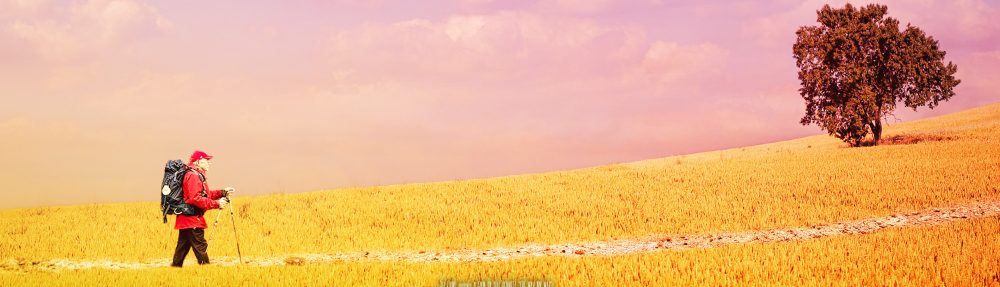
“Before walking my first Camino, I gave a lot of thought to my photographic needs and the challenges ahead. I’ve been taking photos professionally for more than forty years, yet even so I made some big mistakes on that first pilgrimage. I’ve since walked another Camino, and now I wish to pass on what I’ve learnt from those experiences.”
In Photo Camino, renowned Australian film director and photographer Bill Bennett, author of the Camino memoir The Way, My Way, discusses such issues as:
- The best camera to take
- The major challenges facing a photographer on the Camino
- The pros and cons of using your smartphone
- Power management and security of your gear and images
- How to best take landscape shots
- How to protect your camera from bad weather
- How to blog and post to social media
- How to use your camera to enrich your Camino experience
- The twelve Classic Camino shots and how best to take them
- Bill’s Top 100 Tips for photography on The Way
Complete with dozens of stunning photographs, Photo Camino is required reading for anyone wanting to take photos on the Camino de Santiago, or for those that simply want to discover the wonder of this ancient pilgrimage route.
And here is the work-in-progress cover art –


Waiting patiently!!
Hugs
Dale and Lynda
LikeLiked by 1 person
You and Dale will get a copy hot off the presses!
LikeLiked by 2 people
Will be good to have it before I leave. 😊
LikeLike
What do you think of the cover Ingrid?
LikeLiked by 1 person
Bill, I love it. Aside from the photographic eye you applied, this is what I see.
The proportions of the stone marker with the carved concha, enduring, opposite the sorrow stones, vanishing – almost as if the monolith is absorbing the stones, like a meatgrinder- grinding them to dust to vanish in the wind and thus freeing us from the sorrow.
The concha carved, a statement of endurance, that only the elements over time will erode, but in the meantime showing the pilgrim the way.
The light that eluminates in a brightness to be able to reflect the shadow of what I see as a fence, and also some attempt to remove graffiti. Just as pilgrims, we start with many fences around our heart and gradually, the camino magically erases those to free our heart to fly.
So, for me, you captured the essence of the Camino and with it a pilgrims heart.
That brings me back to this day, which of course is Valentine’s Day.
From my heart in flght of friendship, to you, Jennifer and all of my PGS family
HAPPY VALENTINE’S DAY! ❤ ❤ ❤ ❤ ❤ etc., etc., etc., Love and LIght!
LikeLiked by 2 people
WOW Ingrid. I will look again. I saw a Stone Camino marker with some pebbles on top. Guess I view the world simply.
LikeLiked by 2 people
Ah Steve, nothing wrong with your eye sight. My world is not as simple…<3
LikeLike
The front cover epitomises the Camino Bill!:)
LikeLiked by 1 person
The cover photo is gorgeous Bill – it tells the pilgrim story so well with the stones on top of the waymarker, the rough texture of the waymarker itself which you can almost feel just by looking at it, and of course the waymarker star which is the first thing my eyes went to. The shadows are beautiful too – a GREAT photo!
One thought I had for continuity and ‘branding’ for want of a better word, why not use the same font as you did for “The Way, My Way” on your cover? I might be wrong, but I think the James Pattersons and Alexander McCall Smiths of this world routinely use the same font for all their covers.
LikeLiked by 1 person
Hi Jenny – good thoughts, thank you – and yes you’re right – the cover art, or key art as it’s called in the film industry, is consistent with those brand authors. I’ve tried to keep some consistency with the waymaker on both covers, and also the use of blue (font) and yellow (colouring on the waymarker) being the principal two colours of the Camino – however the font on The Way My Way is a handwriting font, designed to indicate that it was a memoir, and an individualistic one at that – whereas this is a photographic guide, and needs something else.
Also what I’ve learned since that first book is that with an eBook on Kindle say, you need a cover that works as a thumbnail – it’s going to be read really small – and so the design elements need to be simple and the font needs to be easy to see.
Complicated isn’t it!
Would like to get into a position that I’m so popular as an author that I become a brand… haha!
LikeLiked by 1 person
Cheers Bill – wow – there sure is a ton to think about with cover presentation alone.
I’d love to see a novel Bill ! How about it? Get that BB brand happening !
LikeLiked by 1 person
haha – working on a novel Jenny… after 8 years it’s almost ready… 🙂
LikeLike
Really? Sounds intriguing! Could INDIA feature in the novel? I wonder!
LikeLiked by 1 person
Nice draft — and I love the cover image and its formatting, very snappy.
As it stands, that white background might seem a little too stark — but that’s easily addressed by choosing the right cover stock.
LikeLiked by 1 person
Thanks Julian – yes – this is principally an eBook cover design – but I like the texturing. But it’s a draft too, and we’re tweaking it a bit… by the way, will get your post up overnight… thanks for your patience. I had my computer go belly up this past week. It’s taken me almost the whole week to get the hard drive replaced and all my files and software reinstalled. Argh…
LikeLike
My 2 TB data hard drive totally crashed over 2 months ago, then my new 4 TB job needed an upgrade to a UEFI motherboard, which in turn needed a new CPU — plus an external HDD case for data extraction from the broken drive, which will take me several weeks to get done ; and if I didn’t know what I’m doing, ~60% of my data would have been lost for good.
So you can guess that patience is something I’ve been having to make good use of recently … 😉
LikeLike
What brands of hard drive were they Julian? With my video and audio files for my film, I’ve got three backups of everything – including all masters on a 6TB G-Technologies Raid, which seems to be ok –
LikeLike
OOOOH I really like the cover photo 🙂 The colour yellow took on a new meaning for me from April 2012!
LikeLiked by 1 person
Thanks Britta – yes yellow and blue now have special significance don’t they!
LikeLiked by 1 person
What a good idea. A niche that hasn’t been filled before. I know this is going to be a tremendous hit. Congratulations!
LikeLiked by 1 person
Hope it finds a readership Kathy! Thank you!
LikeLiked by 1 person
Don’t really recall the brand of the one that crashed, Bill, but that’s unimportant info anyway — the failure was of a purely mechanical origin, as internal vibration caused the data cable to remove itself from the drive.
LikeLike