
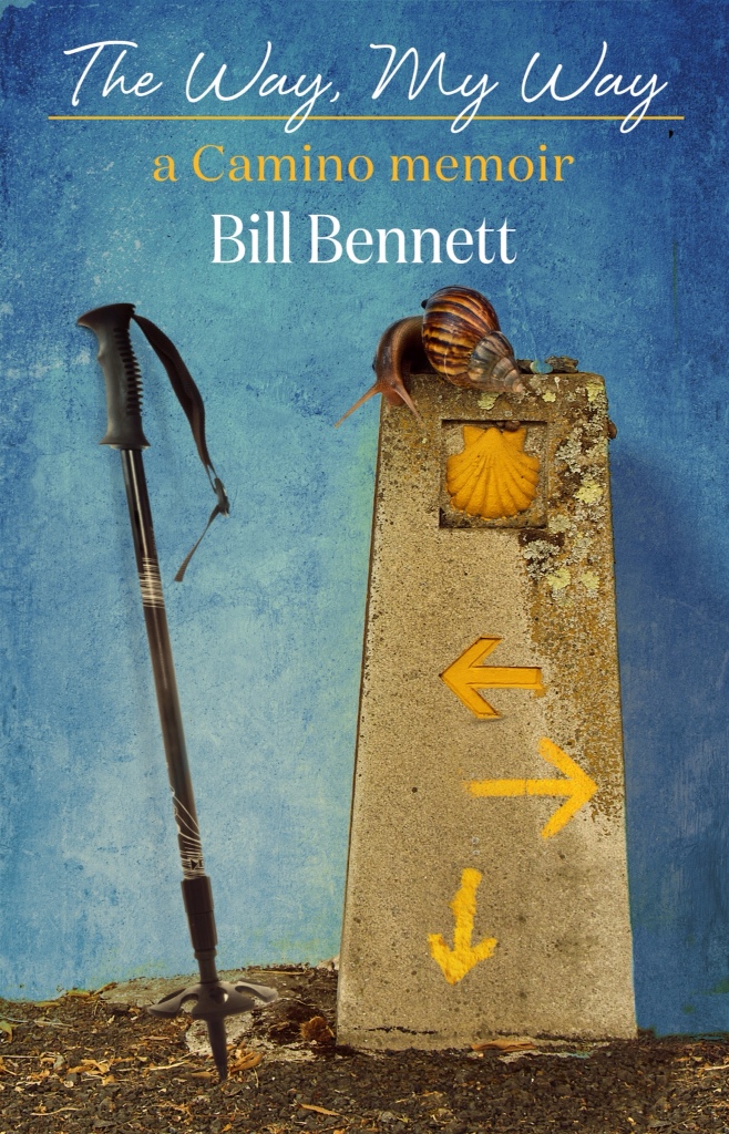
I'm almost there with the book cover.
But I figure I need two trekking poles, not just one – and crossed at the handles, as though they're leaning up against the wall.
But what do you think?
Would this cover make you want to read the book – or at least read the first chapter to find out if its any good?

Bill, you are a brave man! lol I love this cover and yes it would make me want to at least check the book out and then of course go on to read it because it will be such a good book 🙂 Having two poles might be better and yes crossed at the handles.
You did good!
Emily xo
LikeLike
Thanks Emily –
But why do you say I’m brave?
Is there something offensive or off putting about this design?
Bill
LikeLike
No not at all! I just mean you’re brave asking us again for our opinion after all the “suggestions” you got on the first cover LOL
xo
LikeLike
Oh!
Yes!
😀
But it was helpful!
Bill
LikeLike
I agree 2 trekking poles. Otherwise fab!
Arlene
LikeLike
Thanks Arlene!
Still in Madrid? Food good?
Are you jetlagged?
Bill
LikeLike
Bill,
It looks GREAT !! And I think the 2 poles will be perfect although the image with the one so perfectly portrays the solo quality of this pilgrimage. And it also reminds me of being one of the last people out of the alburgues and seeing a lonely pole left behind. How’s that for imagery!!
Kudos to you !!
XOXO
LikeLike
Haha – I hadn’t thought of it that way Jill, but you’re right.
I’ve also asked to see a version without the pole/poles, with the way marker and snail centred, to see if that works better.
Bill
LikeLike
I know you do not need this info but I couldn’t resist. I saw many people only using one pole for whatever it was worth and as a matter of fact used one pole the day that I sent my backpack ahead thinking I would get some relief for my heel which was killing me. The only thing I can say is that using one pole SUCKS! I ended up with a really sore shoulder because evidently it really throws off your balance and I must be a really hard “pole-er” so I wouldn’t ever try that again!
But, that my friend has absolutely nothing to do with you book cover, so its back to work for me!!
xoxo
LikeLike
I thought using only one pole would make you walk in a circle.
LikeLike
Steve, that cracked.me up! Haven’t laughed that hard in a long while! What a hysterically funny image- Bill walking round and round on the one pole!!!!! Thank you, my friend.
🙂
LikeLike
Sister, Glad to have been of service. Steve
LikeLike
No Sister,
He was talking about JILL walking around in circles on one pole.
I thought it was funny too –
But only if it was Jill. If it was me, it was definitely NOT FUNNY!
😀
Bill
LikeLike
Like beauty, it is in the eye of the beholder.
LikeLike
😀
Bill
LikeLike
No, Bill -I’m sorry, but I saw it in my head, and it was definitely you. That’s what made it so funny!
LikeLike
Sister,
then I worry about your head!
🙂
LikeLike
Did I, or did I not tell you I am peculiar?
LikeLike
Yes, you did – and it’s on all the tour pamphlets now!
😀
Bill
LikeLike
Note how I haven’t thanked you for that, Bill.
LikeLike
It was your descriptor!!
😀
LikeLike
I love you two!
Em xo
LikeLike
Hi Jill –
Sister is peculiar, in her terms, and I regard this as a big marketing plus!
And I have told her that she’s the tour mascot, which means she has to sit on the bonnet of the van with her habit flying in the wind, and she has to hold up a tour flag!
😀
Bill
LikeLike
Ooops – I meant Emily!!
LikeLike
I think it’s true, it wound make YOU walk in a circle !! I’m just dizzy thinking about it. :-))
LikeLike
Steve,
that’s my first smile for the day!
Actually, it made me laugh!!
Bill
LikeLike
Haha – thanks Jill!
Bill
LikeLike
Xoxo
LikeLike
Bill
I love the new cover!! I agree, I think it needs two trekking poles. Not sure whether or not they need to be crossed. I think showing two poles shows that the walk was a challenge (where as one shows it was a walk in the park??) And I am looking at the cover while on a laptop working outside so I have strange glare but is that rocks/dirt the poles are resting on and a wall behind it or sky? The delineation between the two is a bit of a distraction. JMHO!!!
LikeLike
Hi Sue –
(is it okay to call you Sue? Or Susan?)
Take a look in proper light. It works okay.
My only issue is that it might be too “busy,” with too many elements.
But I’ve asked to see a version without any poles and I’ll make a decision once I’ve seen that.
Bill
LikeLike
I’ve gone by Susan since the first day I could write. Never Sue or any of the other alts.Just never thought of myself as a Sue!!! Thanks for asking!!!
LikeLike
No worries – just wanted to check!
Bill
LikeLike
What about a pilgrim’s stick/staff. You know, old stick, old stone, etc.
Jill
LikeLike
Yes, I thought about that Jill, but once again it’s too busy – visually.
The image has to work, in the first instance, as a thumbnail on Kindle etc, so it has to have a simplicity of design.
Bill
LikeLike
Oh, and the colors, the arrows pointing in all directions and the title would all make me want to read the book.
Jill
LikeLike
Yes, thanks.
This is a revised version – the first version had different colours.
Jennifer and I wanted the colours of course to match the traditional camino blue and yellow.
Bill
LikeLike
Bill –
Not an artist bone in my bod’ but I think it looks good.
I sense you want someone to be critical though so I’ll toss out alternatives. My objective is to create a visual that reaches out to the potential reader who has no idea of what the Camino or “Way” is and grabs their attention. We have to remember that we’re a “self-selected” population here so we get the visual context more easily.
Option 1
Center the waymarker, sticks leaning up oneside, boots on one side.
Option 2
1) Move the waymarker to the right.
2) Put your pack on the left.
3) Sticks crossed and leaning against the pack.
You are the artist, I am just tossing out an idea here.
Good luck!
Brendan
LikeLike
Bill, I like Brendan’s idea of putting in your backpack and the 2 poles leaning against it. Somehow the 1 pole just doesn’t do it for me, looks out of time… meaning the waymarker conjurs up an ancient path, the snail is you (me and any contemplating pilgrim, walking slowly, living each moment), somehow that one pole, grates at me (I would prefer the simple pilgrims staff – which I used), Unlike kitkatnit, I don’t think walking with one pole is a walk in the park, but it does come to mind with a modern pole.
Ultimately, it is your book, your cover… so don’t pay any attention to my babbling about. 😉
LikeLike
Hi Ingrid,
Yes, I told the designer two poles. No-one walks with just one pole. But that’s what came in this evening. He needs to adjust it.
The pilgrim’s staff and old boots and backpack are a cliche. Also, whenever you put a backpack in an image like this, people’s eye will go to that, and wonder what sort of pack it is, how big it is, how worn and beat up etc.
It raises too many questions.
The most important elements in this image – the elements that give it “tone” and make it intriguing, are the different arrows, and the snail. Anything which detracts from that is diminishing the essential elements of the image.
Bill
LikeLike
Bill –
RE: Steve’s comment regarding a “highly opinionated crowd”
Nah… we’re just real darn helpful folks is all. And glad to be of service, evidently!
Brendan
PS. If you leave comments enabled upon showing us the final then we’ll know you’re crazy. Just sayin…
LikeLike
Haha – love it Brendan!
Next, I’m going to post the blurb.
Now that’ll get some comments, I’m sure!
Bill
LikeLike
That’s the word, Brendan. Helpful. 🙂
LikeLike
Hi Brendan
Thanks for these thoughts.
I have approached all aspects of this book with the assumption of “foreknowledge.” Foreknowledge is what you have to anticipate, and factor in, when you’re writing a movie screenplay.
For instance, no-one walks into a movie theatre “clean,” without any knowledge of what they are about to see. They might have seen a trailer, or a poster, or read a review. In other words, they come to the movie with a certain pre-determined view of what it is they will be seeing.
That means two things when you are writing – 1) You can factor in a level of intelligence and sophistication into the storytelling that you otherwise might not ordinarily do, and 2) You can subversively usurp the audience’s expectations.
For instance, if someone is coming to see a thriller, then you can be pretty damn sure they’ll not only be familiar with the conventions of the genre, they will be working hard to anticipate where the story will go. You have to “wrong foot” them. Which means you need to know the inventions better than them!
As well though, you will need to know roughly what the poster will be, what the trailer will be, even at script stage before the film is made, so that you can write with that audience foreknowledge in mind.
Same with a book.
Anyone searching for a book on the Camino will know what the Camino is about. And they will probably have seen or read other Camino books. This is a niche market. This is not Dan Brown territory.
That said, in the writing of the manuscript I haven’t spent hardly any time explaining the history of the Camino, or even what the Camino is. I’ve dealt with all that in a couple of pars – because I’ve anticipated that the audience has already gathered that information from elsewhere.
Same with a cover.
I’ve purposefully avoided the clichés of a long winding road, old worn-out boots, and a backpack. We’ve seen that so many times on so many Camino book covers.
The elements I’ve chosen indicate tone – the arrows pointing in various directions – which links in with the title: The Way, MY Way. In other words, confusion. Humorous confusion.
The snail is referenced in the book, and the trekking poles are a big issue in the book. And whilst trekking poles are also a cliche, I think they work in this context, along with everything else.
However I do want to see a version from the designer without them.
So in other words, I want to avoid what’s been before – I want the cover to give a sense of the tone of the material, and I want it to be intriguing and eye-catching, whilst still being visually arresting in thumbnail form.
It’s actually a big ask of an image!
Bill
LikeLike
Thanks Bill, What I could understand was very interesting and thought provoking. I am sure the cover will be perfect however YOU decide to print it. Steve 🙂
LikeLike
Thanks Steve –
Key art is very difficult.
A cover that works for a print book to be seen on a bookshelf in a store needs to be vastly different to a cover for an ebook, to be seen online as a thumbnail.
If you go onto Amazon, and look at the various covers, and look at the older books that have had covers designed for bookstores, as against ebooks with covers just for online, they are very different.
Often the great book covers for a print book simply don’t work as a thumbnail.
Bill
LikeLike
Hey, Bill –
If anyone else had tried to explain this to me, they would likely have been as successful at teaching my dog Urdu. I get your points though because of your deep ability at expository writing.
Owing to a peculiar brain configuration I have limited ability to watch, let alone understand most movies – – especially if they require a grasp of context. And, though I read widely, dipping into “Camino literature” has yet to be of interest.
So, I’m a marketer’s nightmare and I thank you for your kind explanation and apologize for the expense of your time helping me to “re-gain the plot.”
Warmest regards,
Brendan
LikeLike
Haha Brendan, no apologises necessary!
It’s 5am here and I’ve been awake since 2am. I ran off at the mouth a bit with that explanation, sorry!
But all this is new to me – this is my first book – and so I am trying to find parallels in my core business, which is making movies. Here are some parallels, but books are a whole new universe too. Which I’m finding fascinating.
What doesn’t change though is attention to detail – and exactitude. Getting it right, no matter how long it takes, or what it costs – emotionally and financially!
Bill
LikeLike
Bill, still have no real clue what you explained, but it’s all good. Cliché or not, sticking to my guns… 2 poles, or non, or an old pilgrims staff, which of course makes no sense for your book, since you didn’t use one. Ingrid 😉
LikeLike
Haha – thanks Ingrid!
I think I have clarity now on which way the image should go.
I’ll talk to the designer soon, then show you all the finished job.
And then explain why I’ve gone the way I have…
🙂
Bill
LikeLike
Just a suggestion my friend, but when you show us the finished cover, do not ask for comments. This is a highly opinionated crowd. 🙂
LikeLike
That’s what I love about it!
I am a thief when it comes to good ideas. And it forces me to articulate why I like something. And why I don’t like something else.
I find the while process very useful!
Bill
LikeLike
Bill, this cover is gorgeous , and if I saw it in a shop I would definitely pick it up..But yes, it needs two poles, leaning as you describe. Otherwise when I look at the cover Il think “What’s holding the pole up?” instead of “Ooh, got to read that one!”
LikeLike
Thanks Sister –
Jennifer and I have been tooling away on this with the designer for some time now.
It’s nearly there.
I think once done, it will have visual cut-through.
I have worked with film distributors for thirty years on movie posters, and whilst the two are separate beasts, the same principles of visual design and storytelling hold true.
The guy who has designed this is Australia’s top graphic artist for movie posters, iTunes slicks, DVD jackets etc… He really knows his stuff.
Bill
LikeLike
Hi Bill,
The cover is great! And yes, I would definitely buy your book (even though it does not have all the covers 🙂
Love,
Margit
LikeLike
Margit,
Thank you! Much appreciated!
Bill
LikeLike
Hi Bill
I’m reading this on my phone so perhaps closer in size to the thumbnail that will be used as the representation of your book.
I love the colours and they in them self would make me take a second look. I like that they aren’t block colours.
Personally I only walk with one pole but most do two. I agree you need two but I’m not sure I’d cross them. Perhaps have them leaning against each other. So one upright and the other leaning into it. To me the cross is like saying no, its final and finished but the leaning is almost as if you are saying you are supporting yourself.
Looking at this on my phone with my just woken bleary eyes I wasn’t sure what the brown thing was on top of the marker. It was only after reading the comments and then zooming in I saw it was a snail. I love the analogy but perhaps for a thumbnail it might need to be clearer. A more simple snail.
I’ve just tried to scroll back up to see if the colour of the font works but the phone won’t let me.
Having said all of that even if you left the cover exactly as it is I would want to read it. The colours certainly work to grab my attention.
Good luck
Donna
LikeLike
Hi Donna,
Looking at the image on your phone is a good way to look at it, because that’s how a lot of people will see it.
Yes, the snail in that form does get a bit lost. It doesn’t jump out at you.
What I’m interested in is where your eye first goes when you look at the image, because that’s the most important thing. That establishes subliminally your first impression of the book.
Bill
LikeLike
Bill,
Love the snail….the humor it adds…maybe because I remember the snail story!!!
Looks great!!
Deb
LikeLike
Thanks Deb!
Of course there will only be a few people who will have read my blog and remember the snail – although maybe not that small a number because the blog has now become quite popular – but it’s an intriguing image, and it provokes questions.
And that’s ultimately what you want from a cover – to pique interest.
Bill
LikeLike
Hi Bill. First impression …. Love the colors and texture and yes I would definitely pick up the book and even if I was not familiar with the Camino I think I would be drawn to the book.
Being picky … Perhaps the poles could be a bit bashed about. ATM it looks like a brand new pole from the shop. The little discs at the bottom get misshapen or cracked and broken and after a while the rubber tips become muddy and worn. Somehow that pole looks superimposed on the picture not actually resting on the dirt.
This IS being picky Bill. I don’t think it would enter my mind if I actually picked up the book. I would just simply turn it over and read the blurb on the back.
Debbie
LikeLike
Hi Debbie,
Thank you, and yes, I know what you mean – but when I look at my poles, having gone from Pamplona, where I bought them (I started in SJPP with a staff), they don’t look appreciably danged about.
The poles don’t “read” travelled, unlike boots.
Bill
LikeLike
Wow I am much rougher on my poles than you Bill. One of the baskets has broken and fallen off and the other is very misshapen. I have replaced both rubber tips as one had worn right through to the metal. And there are quite a few scratches here and there as well. Admittedly they only cost about 25 euros and have done what i consider some pretty hard yakka stuff in the Aussie bush. I think you must swing yours about like the leader of the marching band Bill.
I need a marching band icon here but can’t find one!
Debbie
By the way Bill, that is one whopper of a snail!
LikeLike
haha – that’s funny!!
yes, I must be a bit of a ponce with my poles!
anyway, they’re not featured in the final version now.
Bill
LikeLike
Bill, nearly there.
Will throw in my 2 cents worth. Love the colour and texture. Two poles please, but they need to be connected, in some way, to the Way marker. Agree that crossed poles have been done over and over. At the moment the pole is just there, all alone, disconnected.
The little snail is great, but, in a thumbnail, may be a bit difficult to identify initially. Very close in colour to the top of the marker. For what it’s worth…
Looking forward to the finished product.
Anne 🐌 🐌 🐌
LikeLike
Anne,
Love your three snail smilies!!
Yes, there’s not a clear colour delineation between snail and marker.
It kind of gets a bit lost up there.
Thanks!
Bill
LikeLike
Hey Bill: I like the poles enough, but did you consider leaning your backpack against the wall with your well worn boots in front? Just an idea. Thought it might be more attention grabbing. Julie
LikeLike
Hi Julie,
Want to avoid that – boots and pack.
I want to try and make this a little different – something we haven’t seen before.
Thanks!
Bill
LikeLike
Hi everyone –
Bill – Great cover photo! I’m with the ‘two poles’ group … the snail is subtle … you don’t see it immediately (or at least I didn’t) as it doesn’t jump out at you … I kinda like that … it sneaks up on you and you KNOW there’s going to be a story attached to it!
Cheers – Jenny
LikeLike
Jenny, thank you!!
I’m just now waiting for a redraft from the designer, and then I’ll post it.
By the way, when’s the next Camino Sydney dinner? And will Britta be back in time for it?
Bill
LikeLike
Hi Bill – my pleasure to put in my thoughts on the cover. It’s a privilege for me to do this and it’s so kind of you to want to involve us all with it. Thanks.
Pilgrims in Sydney … next meeting is a Lunch as it’s an ‘even’ month and we’re all meeting for the first time at the new Spanish Club premises which, from memory, are at No. 1 Dixon Street, opposite the Entertainment Centre. 12 noon – just roll up as usual. I’ll double-check the address and post it when I get back home next week – I’m at Culburra Beach at the moment doing the set-up for some friends of ours who’re arriving on Friday – good training for an hospitalera!
Britta might ‘just’ be back … I think she was going o/s for 3 weeks so I’ll double-check that too and let you know in the same post.
Cheers – Jenny
LikeLike
Cool – thanks Jenny.
It would be great if she is just back, because she’ll be bubbling over with stories!!
Bill
LikeLike
No worries Bill.
BTW – Britta is never short of a great story! She sure knows how to tell a tale!
Cheers – Jenny
LikeLike
I kind of gathered that when we met! She’s a wonderful raconteur!
Bill
LikeLike
Absolutely! Cheers, Jenny
LikeLike